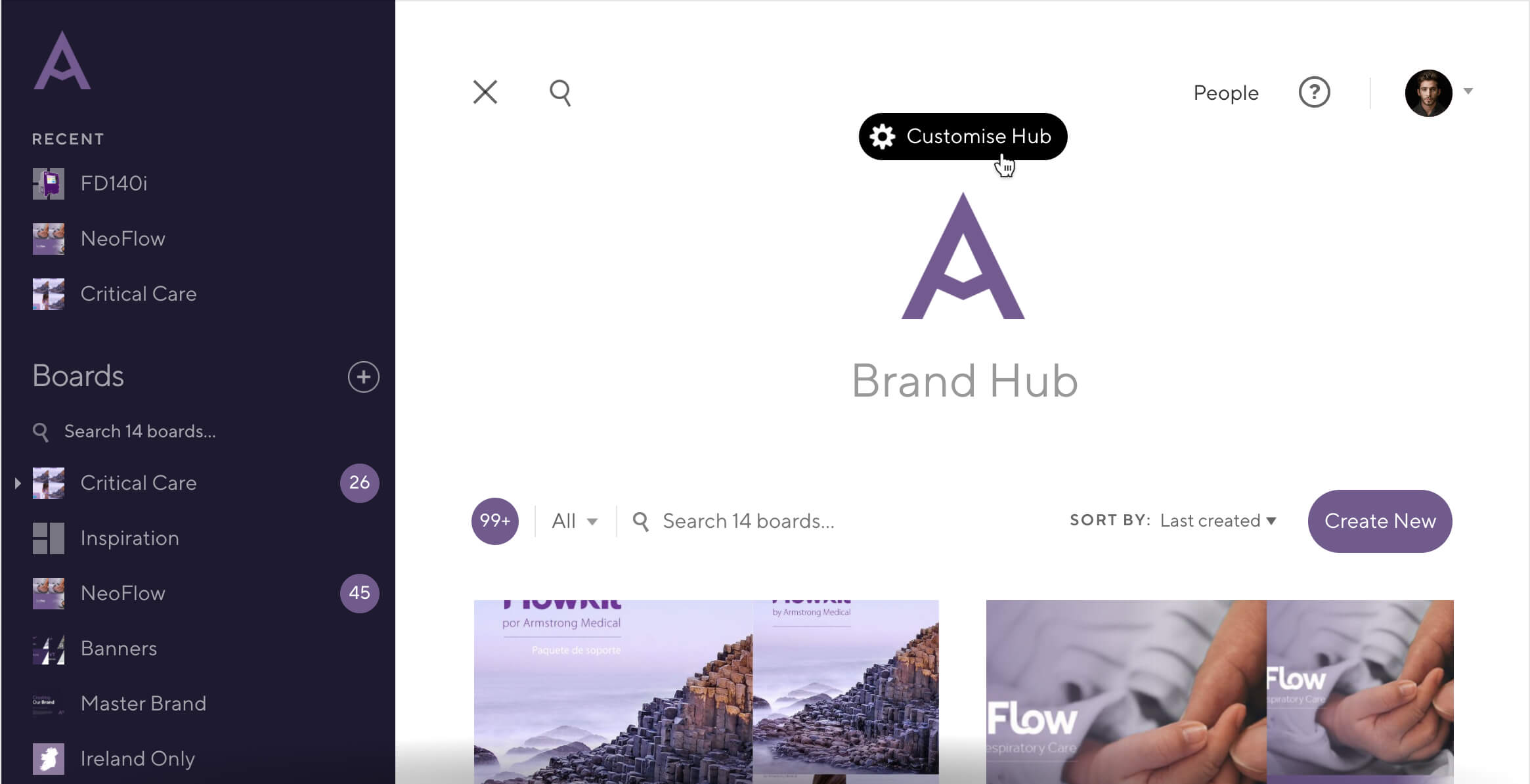
What’s the point of a brand hub that isn’t on-brand? Today we’re launching a ton of new customisation controls to let you define the core elements of your brand, and ensure your hub feels like home.
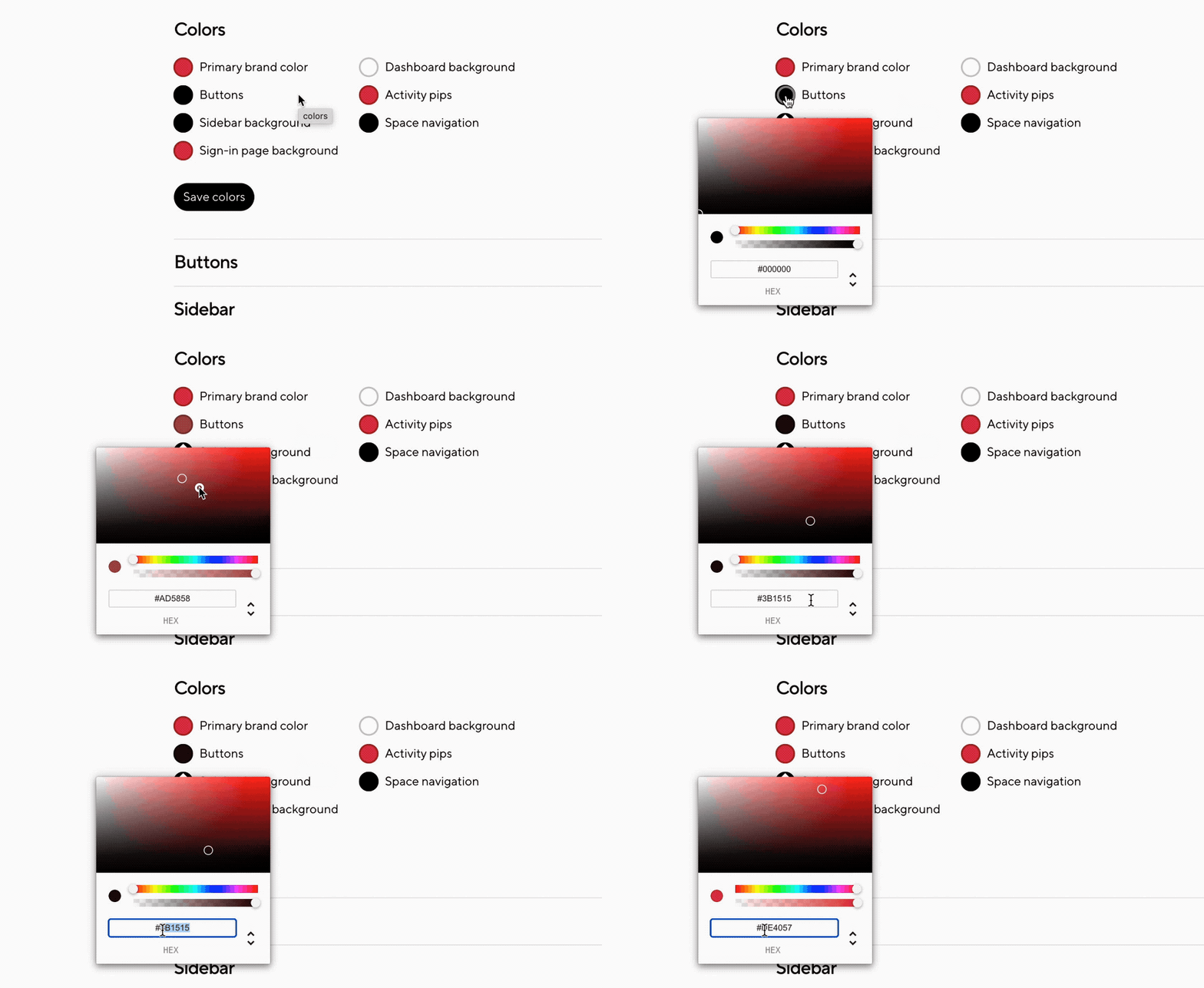
Get creative with color
Color is one of the most visible elements of your brand. You can now set a brand color to quickly theme your hub, or choose individual colors for everything: from the background to the buttons.
Brand your buttons
Is your brand soft and friendly, or sharp and sophisticated? Choose a button style that matches, or create a custom style for pixel perfection.

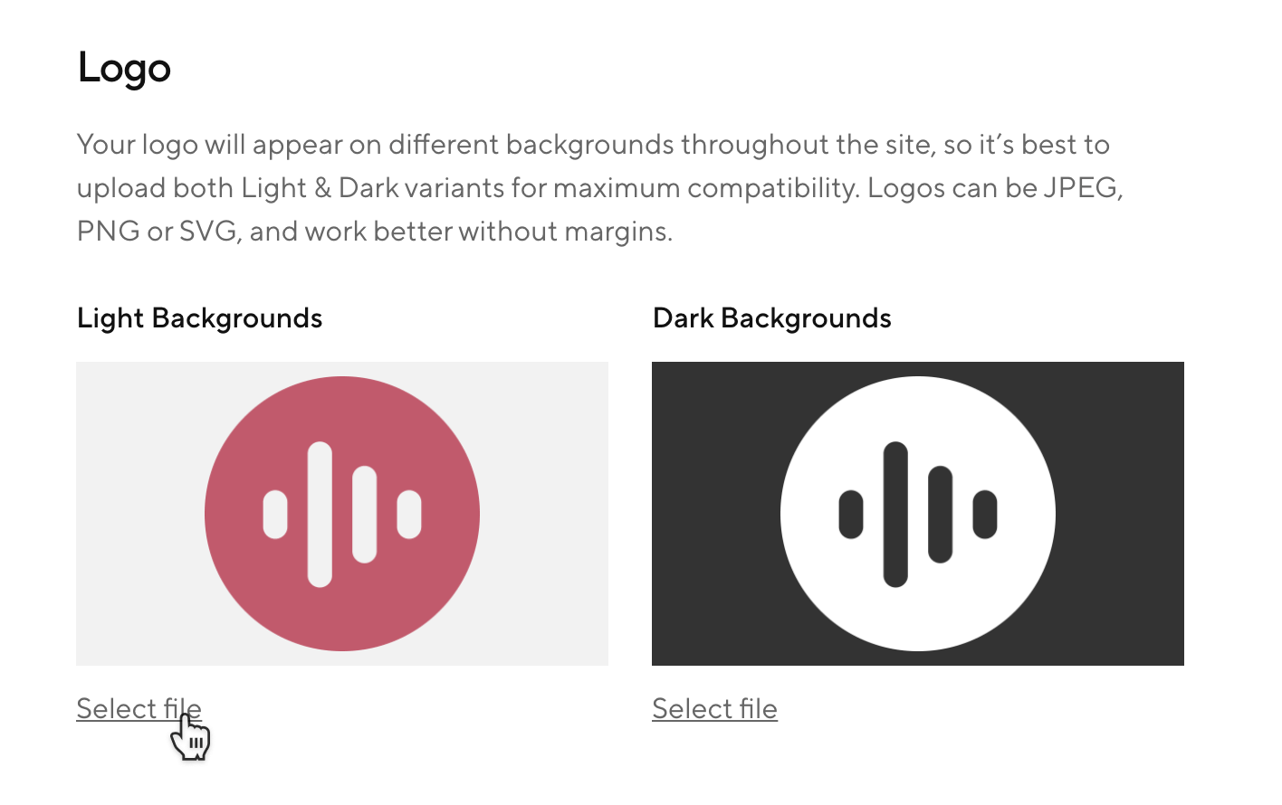
Add your logo, in all its forms
Your brand is more than a logo, but it's a good place to start. You can now upload light and dark variations of your logo so it looks great on every background. You can also tweak the size of the logo in your sidebar so it looks exactly how you want it to.
Name your hub
Whether you’re building a Brand Hub, Creative Hub, or Distributor Portal, you can name it something that the entire team will recognise. Whatever name you choose will appear on your dashboard header and sign-in screen.
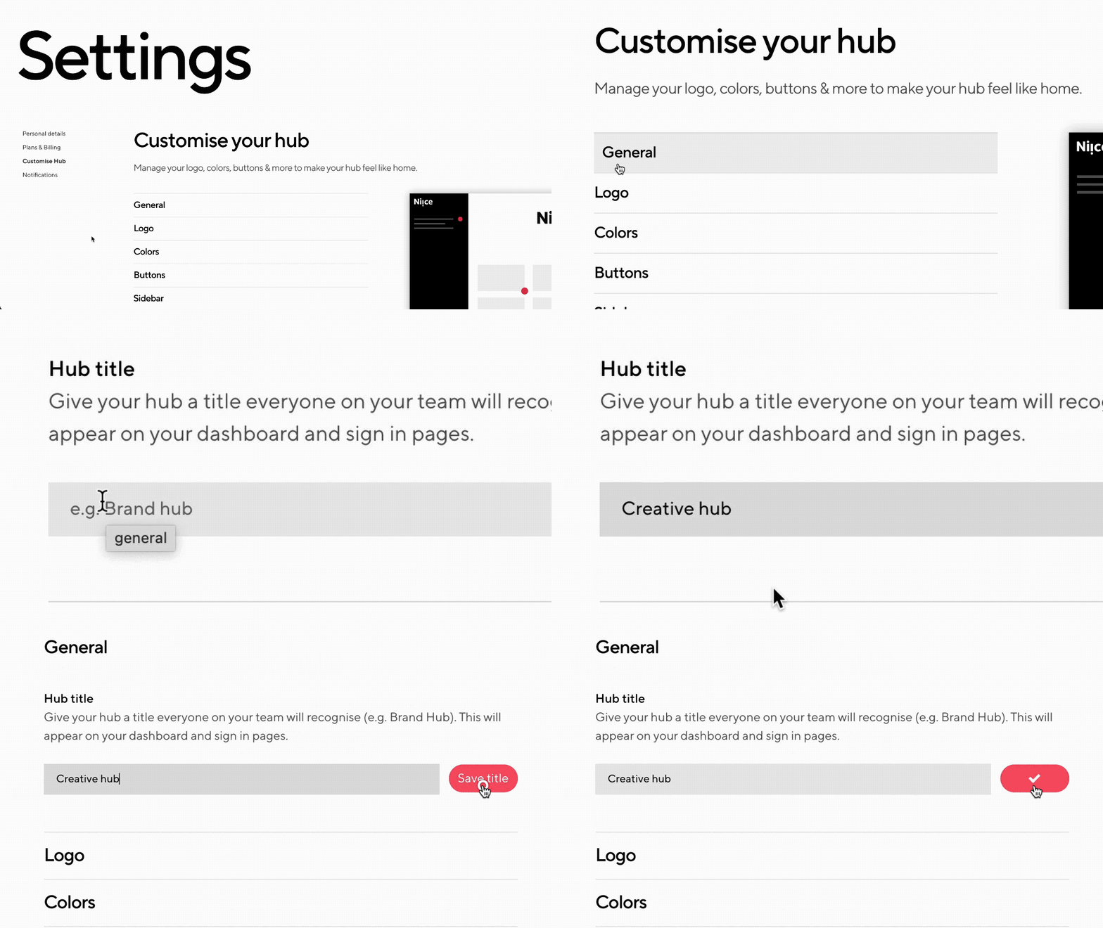
Ready to start customising your hub?
Head over to the new Customise section on your settings page!
Proud of how your hub is looking? Send a screenshot to @NiiceApp on Twitter, we’d love to share it!
