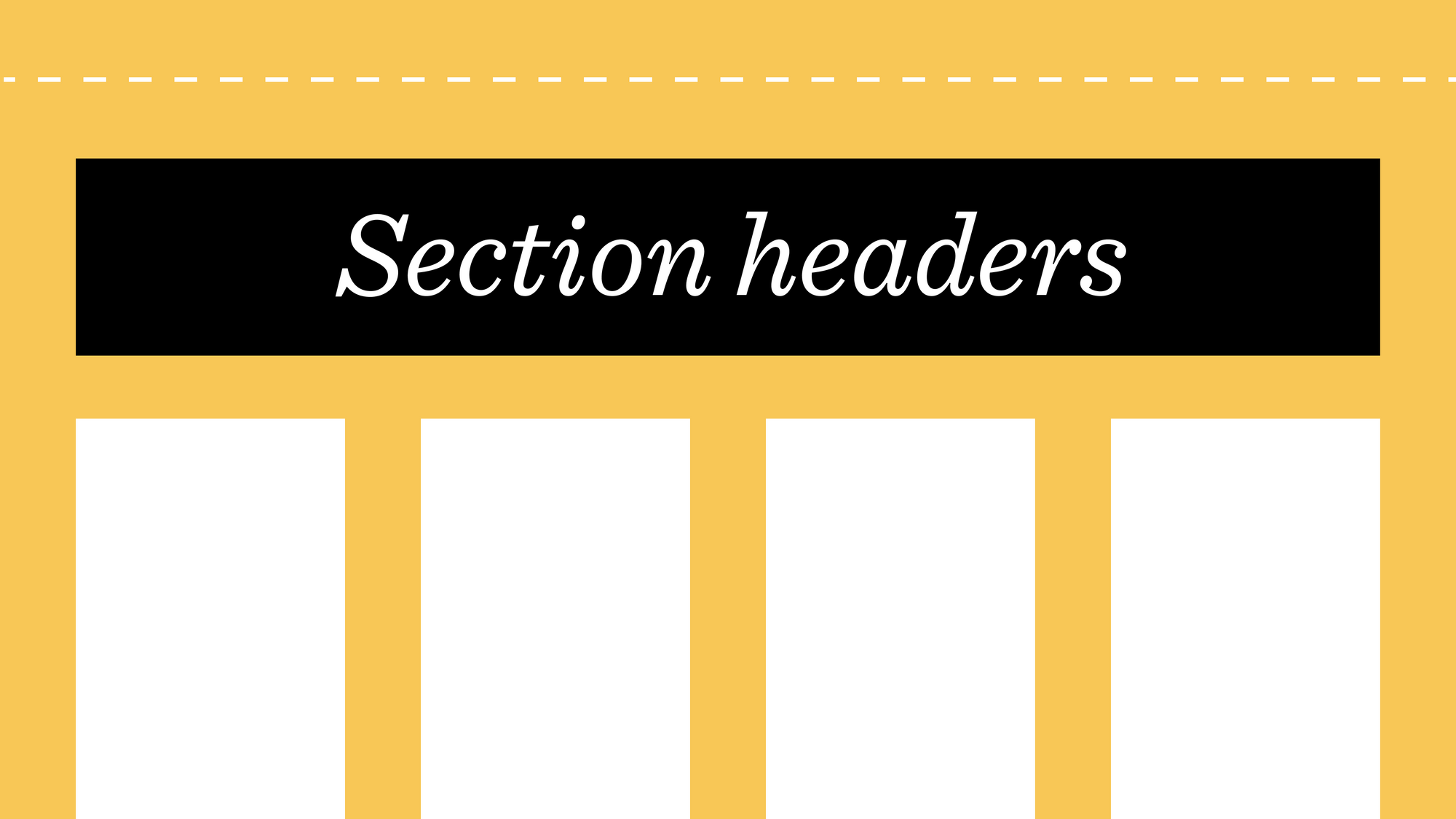
For too long, text editing in Niice has been more difficult than it should be. Simply adding a title to a section meant dragging in a text block, resizing it, and moving it back to the top every time new content was added. To help make text editing a smoother experience, we're introducing Section Headers, a faster and more intuitive way to add context to your boards.
What is a section header?
The section header is a new full-width text area at the top of every section. It sits above the section’s layout grid, so when new content is added it will pop in directly below the header.

Section titles
The first element of a header will be treated as the section's title and used in the section navigation by default.
If you’d rather the first element wasn’t what showed up in the navigation, you can still override it in the section toolbar. Just hover over the section header area and the section toolbar will pop in.
Header height
You can give your title a little more impact by adjusting the header height. By default, the header height is set to ‘Auto’, which means it will be as tall as the content within it. As you type, you'll notice the content being pushed downwards.

If you select 33%, 50% or 100%, the header will always be at least that height (relative to your browser window). Or, if you don't need a section header at all, you can always hide it.
Adding headers to existing sections
To avoid disrupting your current layouts, existing sections have their headers hidden by default. If you’d like to add a header to one of your existing sections, simply change the section’s height to ‘auto’, and the header will pop in at the top.
Alignment
Just like with text blocks, you can toggle the alignment of the section title and description, so you can choose to have your heading left, right or centre aligned.

If you’ve set a minimum height for the header (e.g. 50%), you can also switch the vertical alignment of the header text between top, bottom and centre.
Section grid options
As well as board-level column and gutter controls, you can now adjust the number of columns and gutters for each section. This means you can have one section that has 6 columns and 2% gutter, followed by another section with 10 columns and no gutter; giving you more flexibility to create more complex layouts.

Section headers and flexible grid options is the first step in helping you create more complex layouts. They're now live for everyone, so have a play around with them and let us know what you think 😊

